Four Different Christmas Table Looks
WORDS: Chyka Keebaugh
PHOTOS: Porter Davis
Any excuse to style a table setting and I'm there, so Porter Davis set me a challenge to create four different Christmas table looks. Here's what we created.
I recently had the pleasure of being invited by Porter David to visit their World of Style showroom. The showroom is filled with ideas and inspiration on how you can create your perfect home. They feature all kinds of ideas on everything from kitchens and bathrooms, floors and walls to lighting and even roofing.
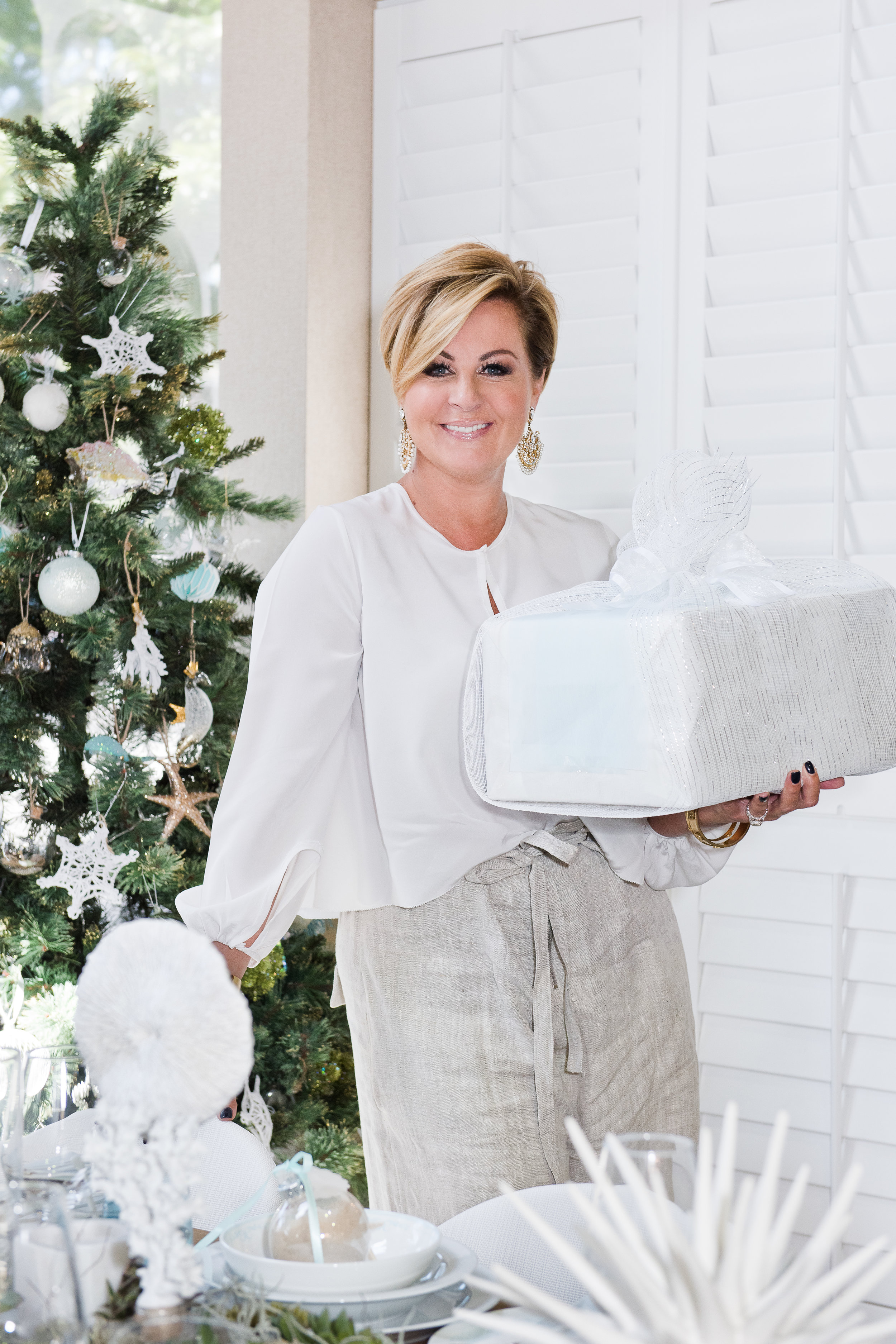
At the World of Style showroom I hosted a Christmas styling workshop as part of their Masterclass Series. I loved having the opportunity to chat with an eager and excited audience about my most favourite things to do in the lead up to Christmas; dressing the table, creative ways to wrap your gifts and how to decorate the tree. In particular, I presented four Christmas styles - a collaboration of ideas from myself and Word of Style - centred around four themes; Classic, Contemporary, Designer and Resort.
.01
A Classic Hamptons Look
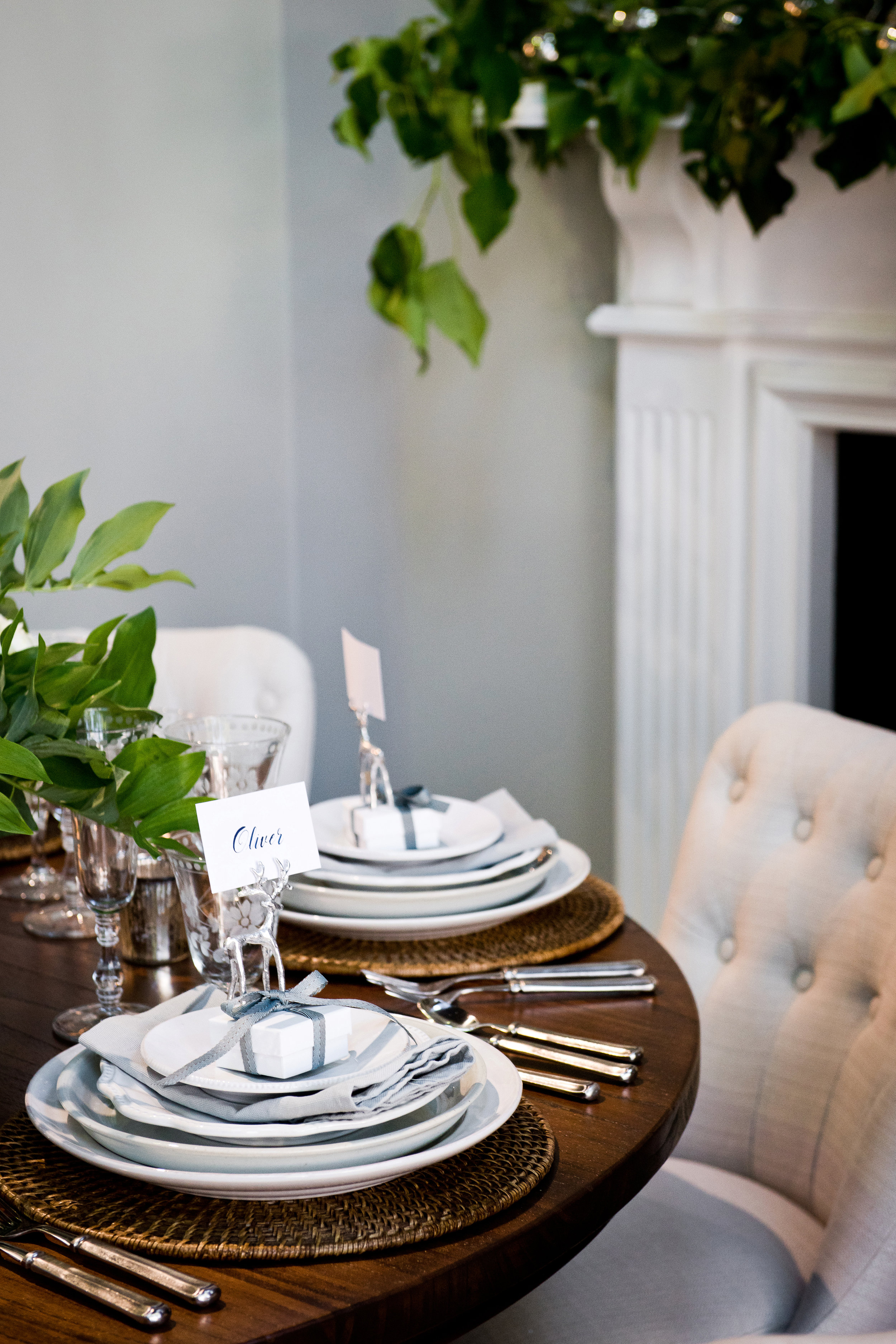
To me, the Hamptons style is an absolute classic. It is full of clean white space, rustic charm and inviting nooks. Designing a table in this style comes very naturally to me as it is one of my favourite styles. For this table, I stuck to traditional white and silver wares and materials, which then sat atop dark, rich woods to create a luxurious and layered look. The rounded dining table created an intimate space and I set to filling it with classic white-on-white plates, a selection of etched glasses and traditional silverware.
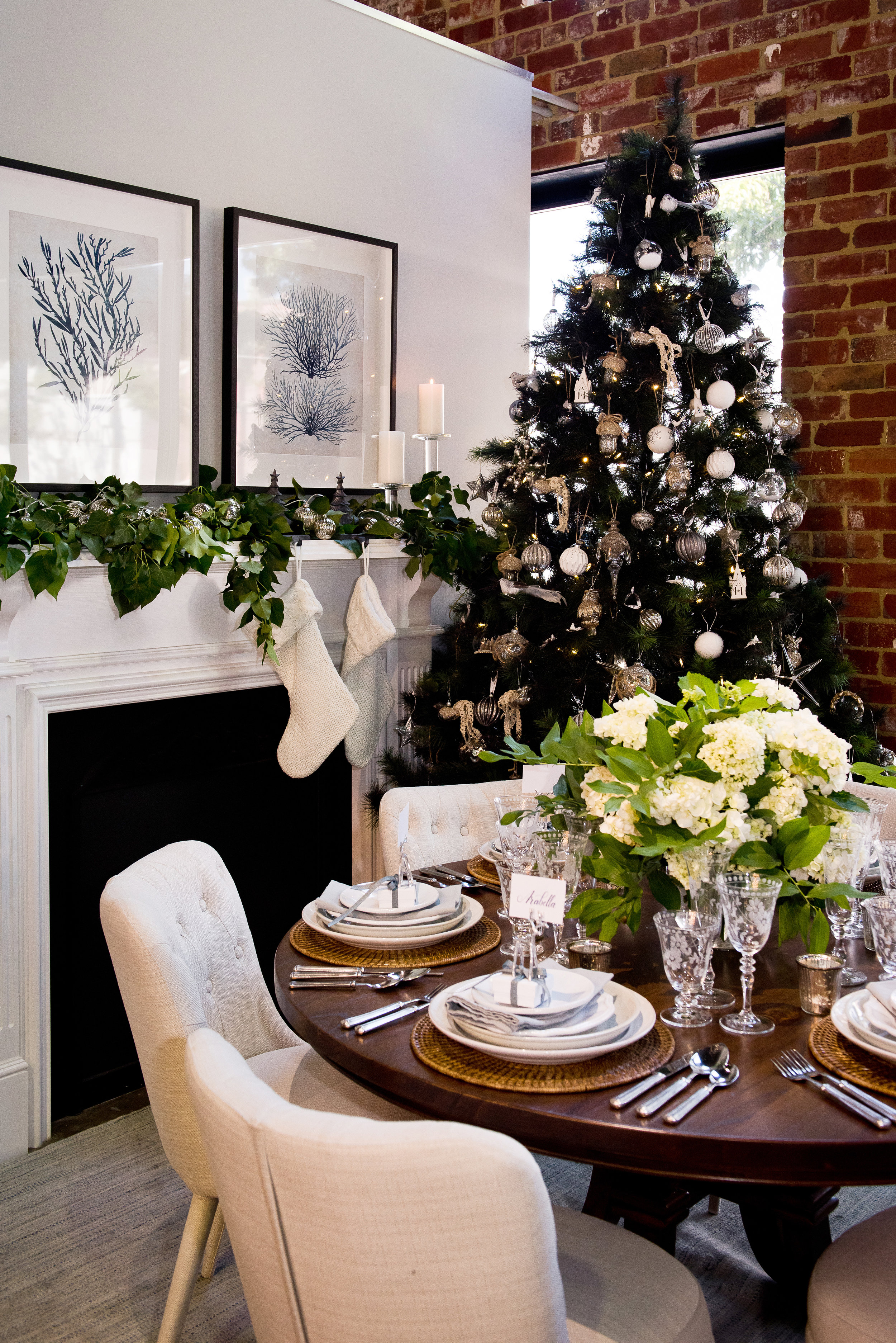
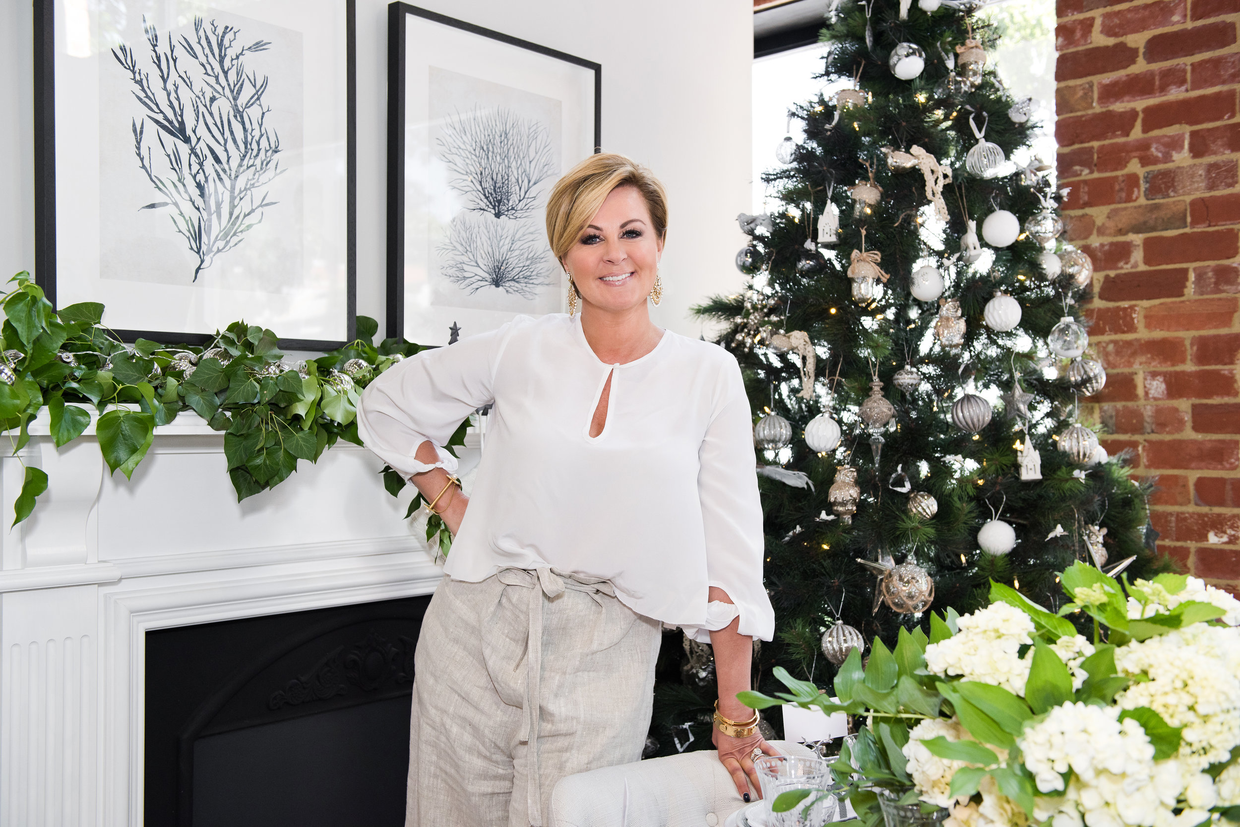
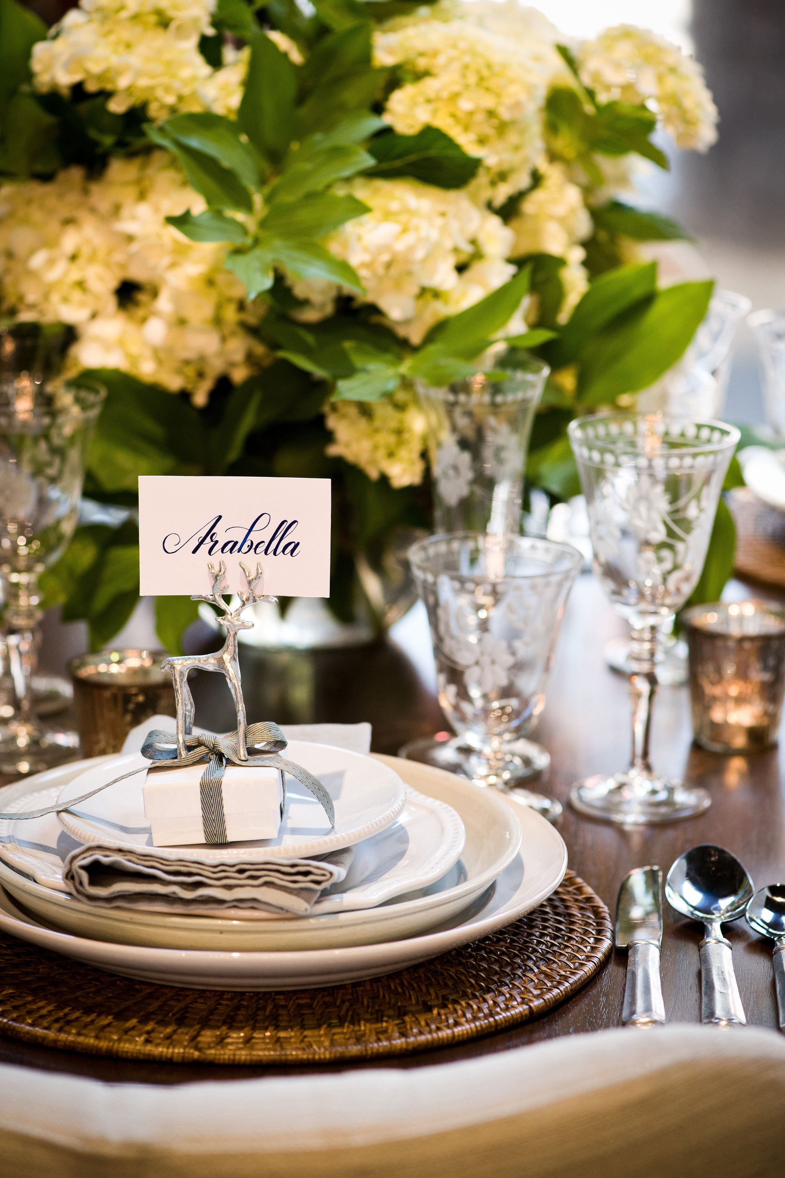
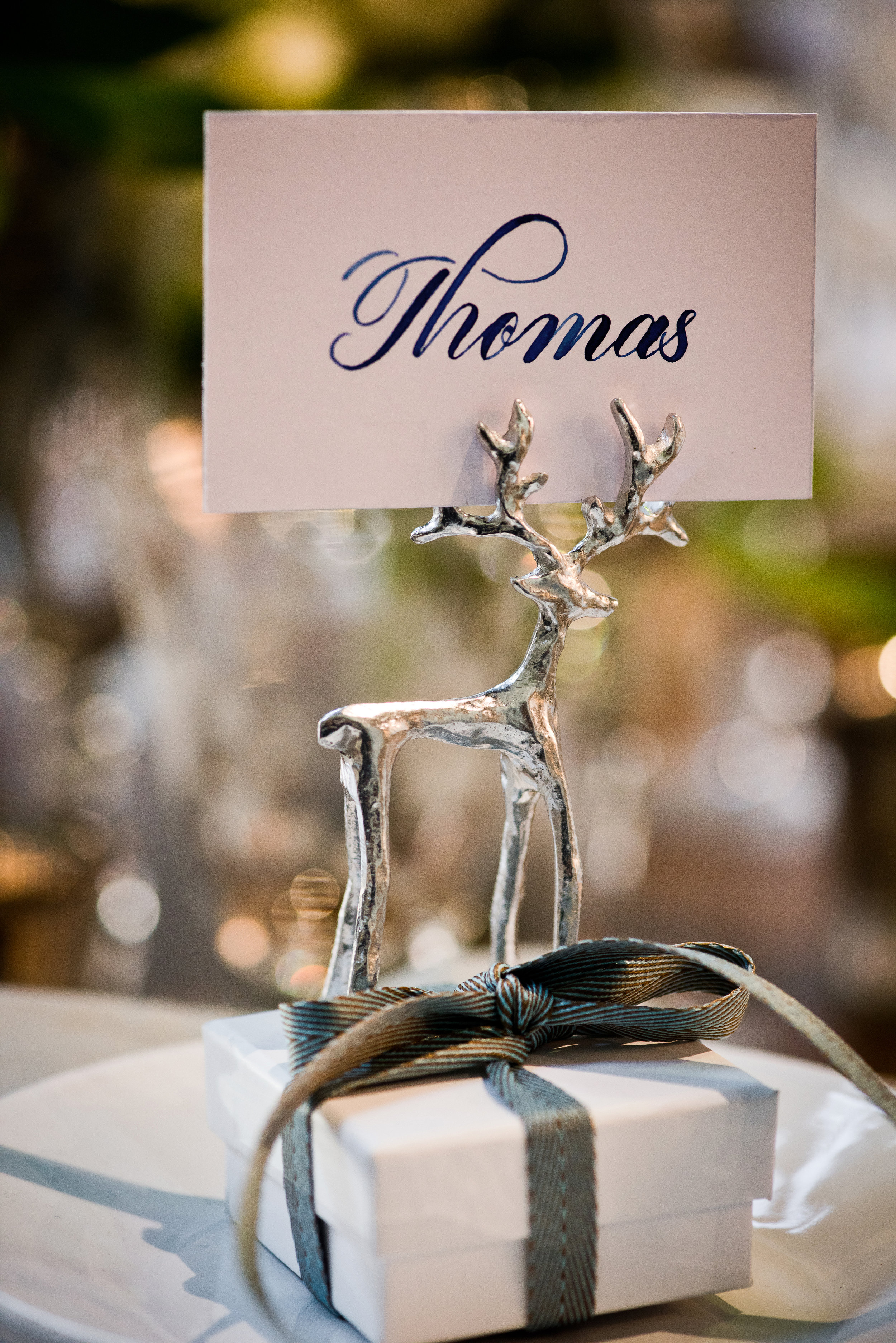
When trying to create a Hamptons look, think about introducing white flowers into the space to add to the soft, gentle nature of this look. I've chosen to use Hydrangeas; they're romantic, a little vintage and utterly gorgeous. Using an abundance of Hydrangea stems as my table centrepiece completed the look.
Everything in this Classic Hamptons style is understated and chic. Nothing is over the top and it all works to achieve a traditional Christmas look. To create the look, start with a dark wooden base and introduce delicate whites via your wares. The idea is to create some subtle elegance and luxury here, so it presents a good opportunity to roam your cupboards for your old silverware - I love the idea of bringing back old treasures into a new space!
.02
Contemporary Scandinavian Look
Everywhere we look these days we can see the influence of simple, Scandinavian design. For a Scandinavian Christmas it's all about lush pine, blonde woods and natural greens. A non-fussy wooden table was the perfect base for a fun centrepiece that included antlers, pinecones and woodland candles all sitting amidst layers of moss. I then continued the wooden theme by using a slice of silver birch as a placemat and pinecones as another decorative motif. The textures and tones create warmth in the setting, making it feel homey and eclectic.
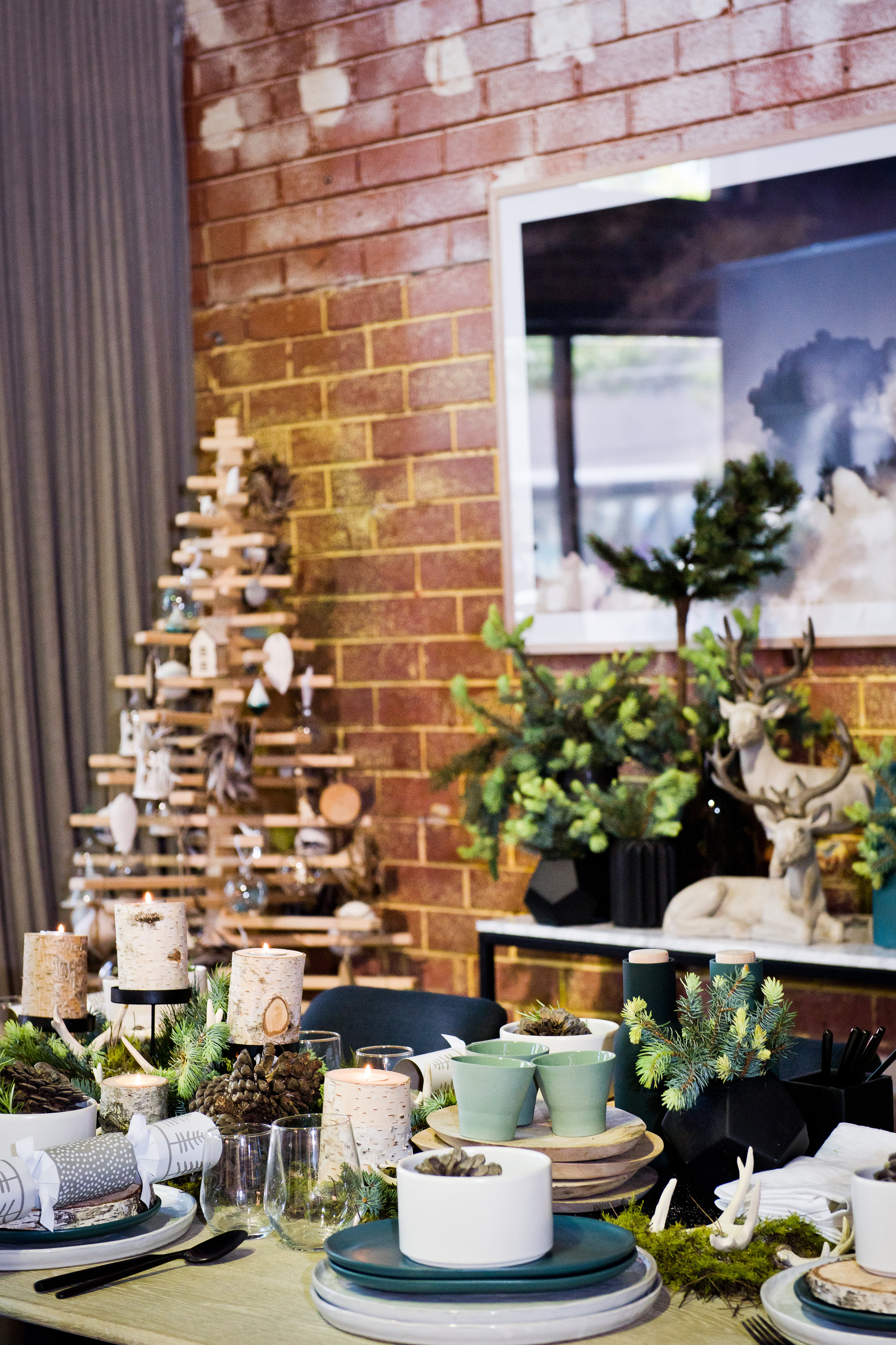
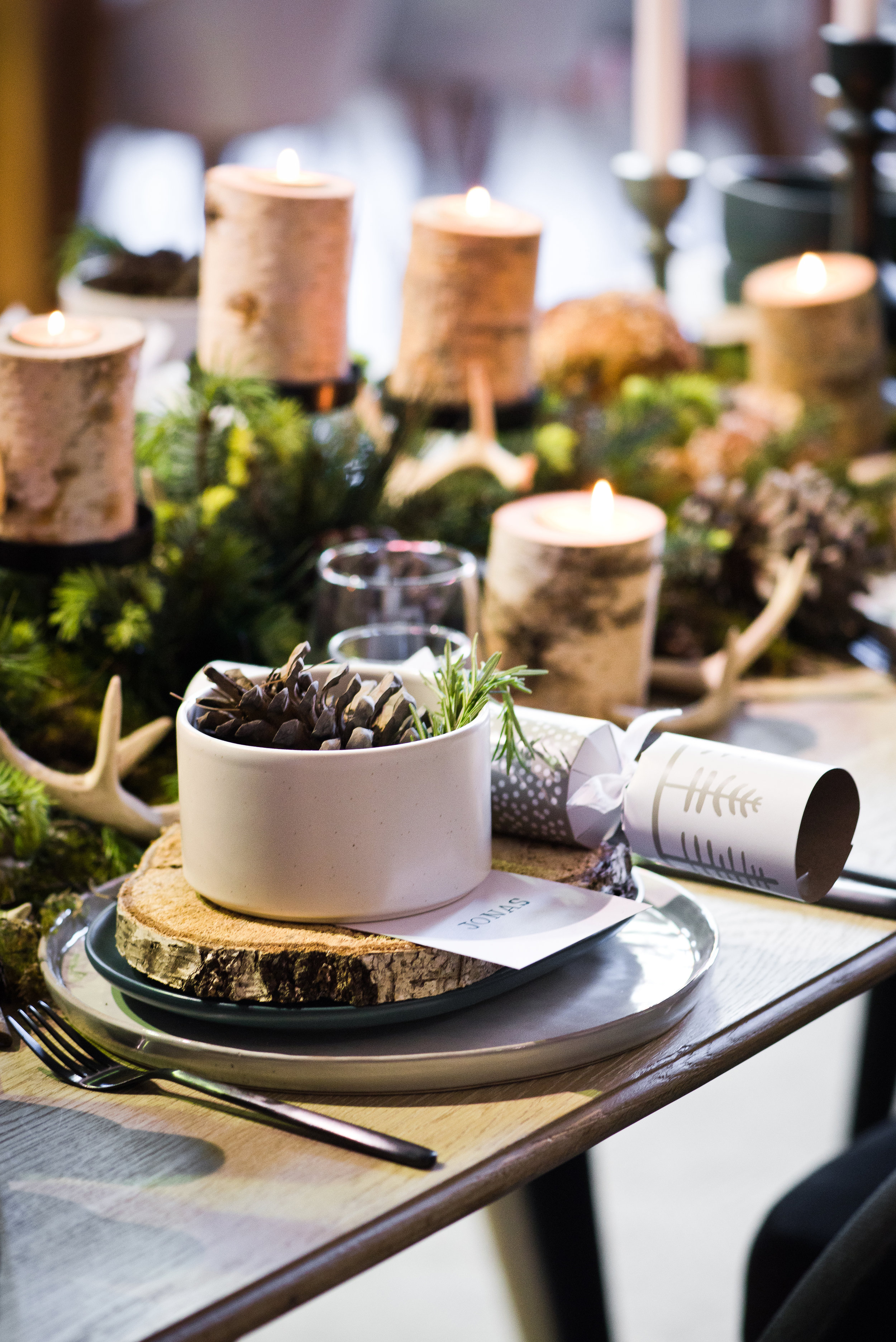
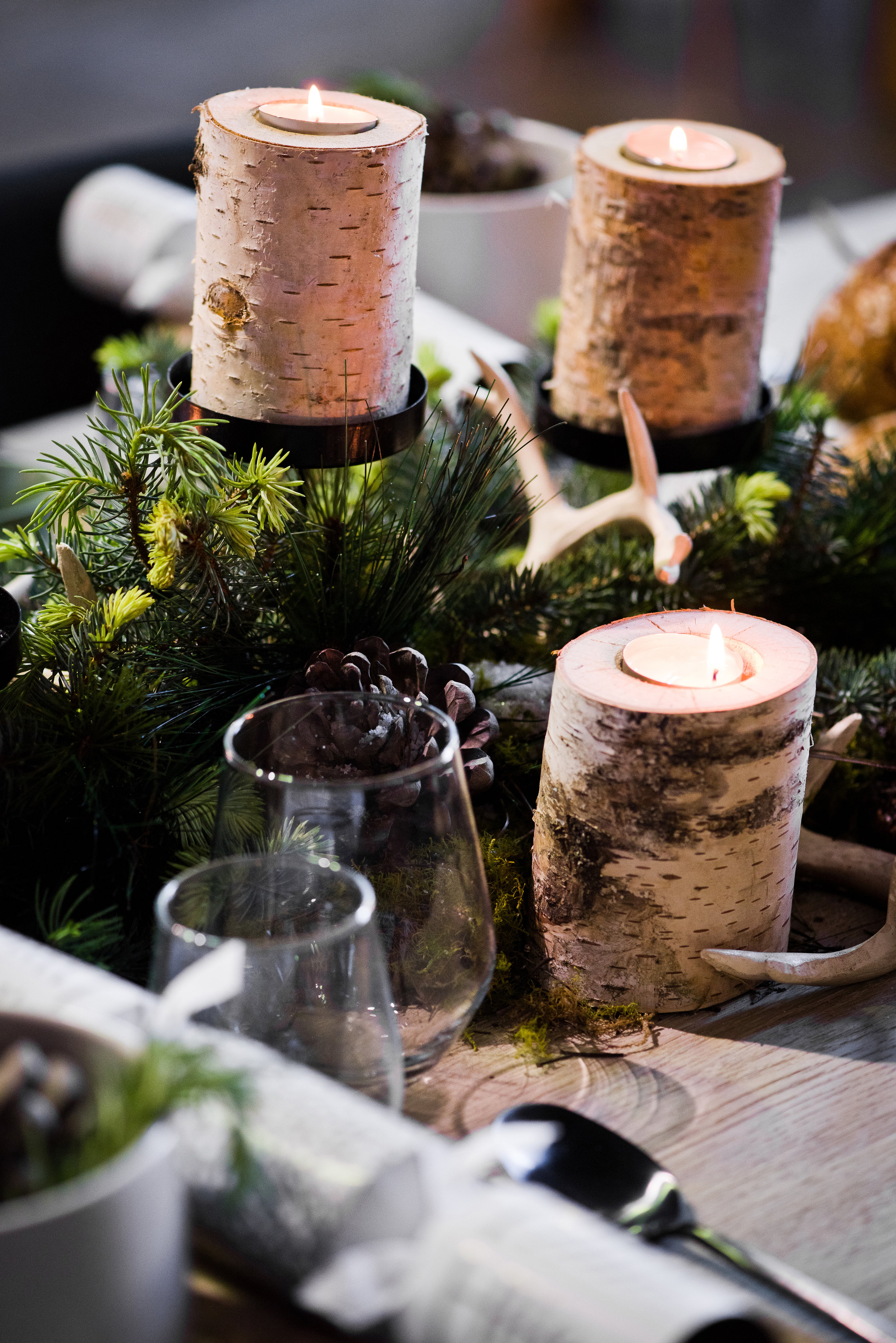
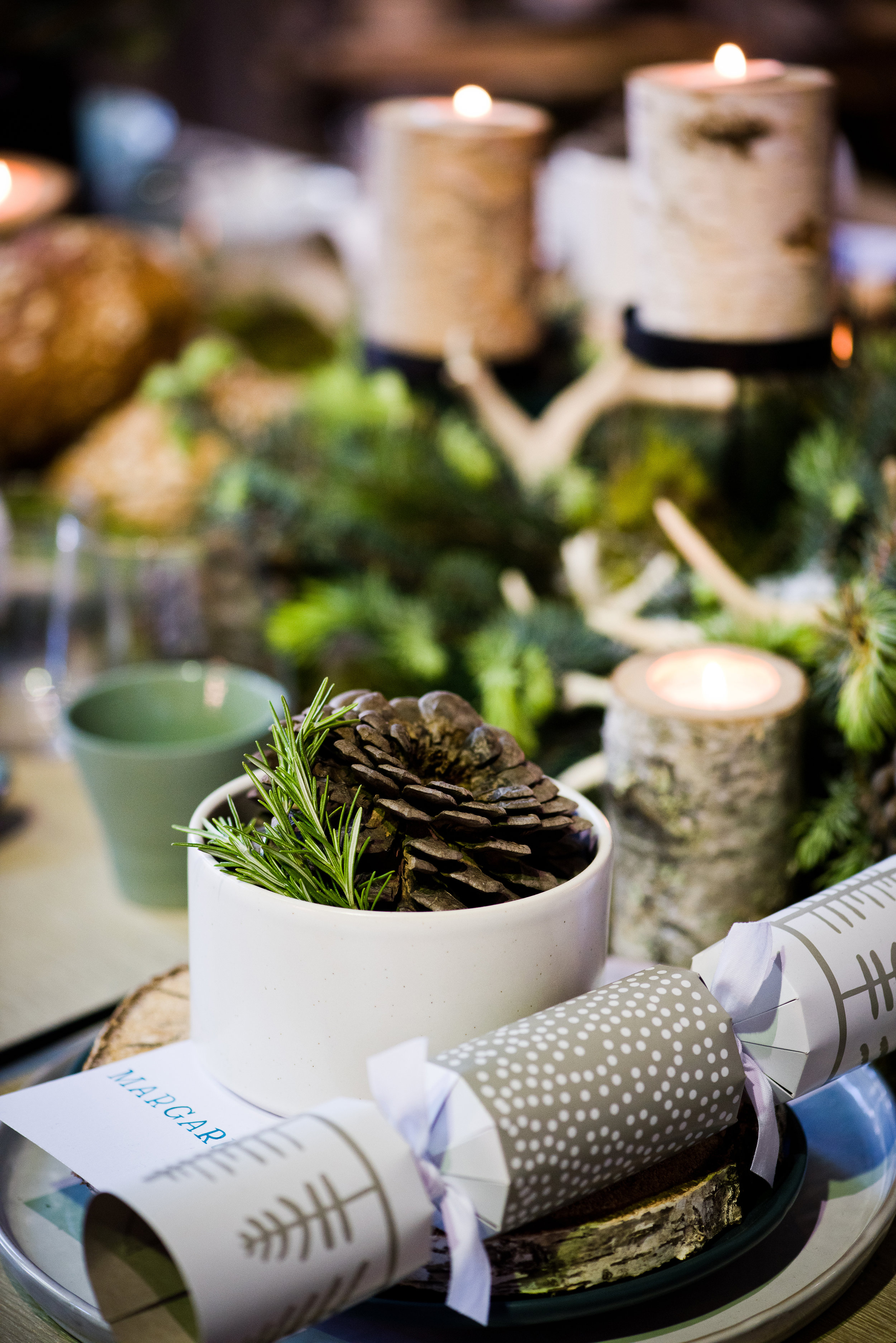
The glassware used is relatively simple but classic, not to take any attention away from the wooden textures, which is clearly the focal point of the time. Using matte ceramic plates, simple bon bons and wrapping with pop of green that link the table to the minimal wooden tree.
To create a Scandinavian look in your table setting, think about introducing light-coloured wooden textures and earthy tones. Nothing about the Scandinavian look is dark or moody; everything is light, bright and natural, and it can also be minimal too.
.03
A Sleek Designer Look
Slick and sexy, this designer look was inspired by the masculinity of the city of Prague. Dark, grainy woods, black and navy ceramics and golden cutlery all make for a very sleek style. This setting is quite graphic; the sharp lines in the stripes of the glasses and the perfectly rounded plates and bowls create an interesting contrast of hard and soft textures. To further soften the look and add some warmth to the table, I introduced the olive and eucalyptus branches and candles as the centrepiece, providing and anchor for the darker colours and breaking up the monochromatic colour palette.
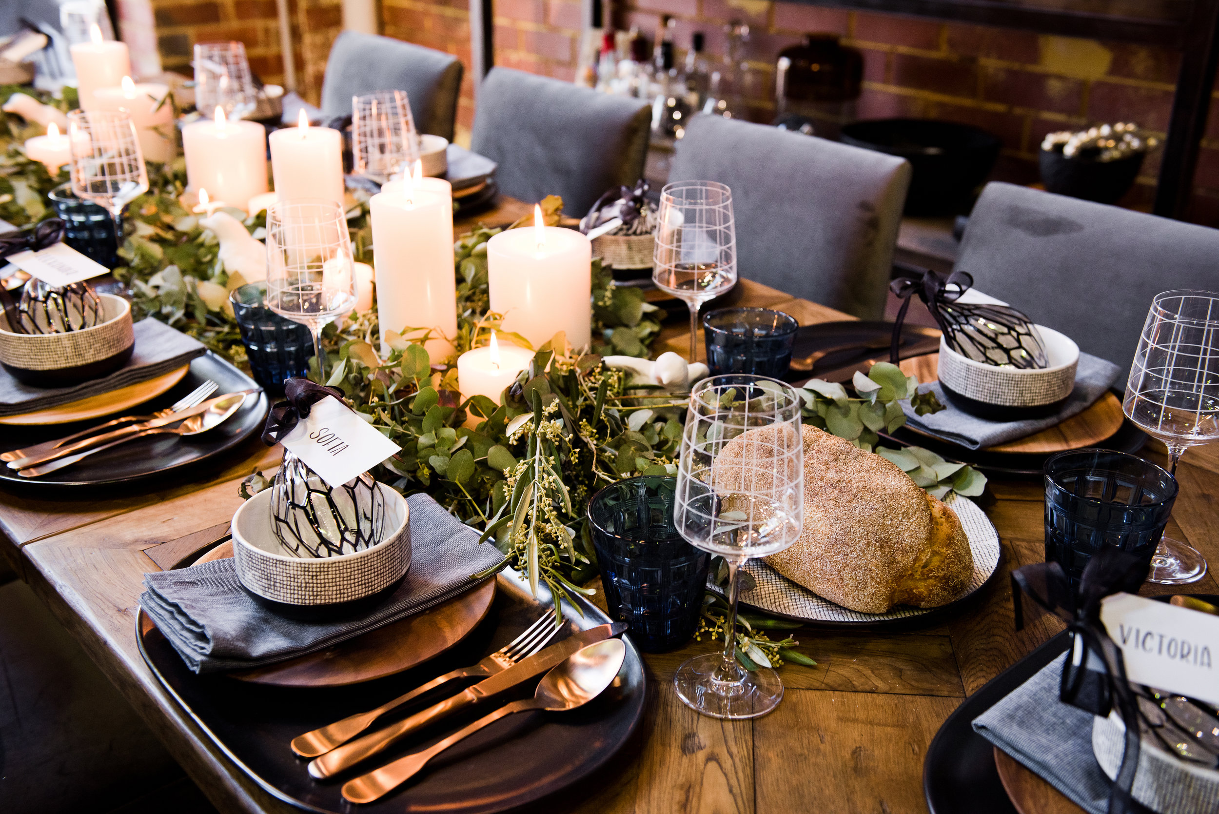
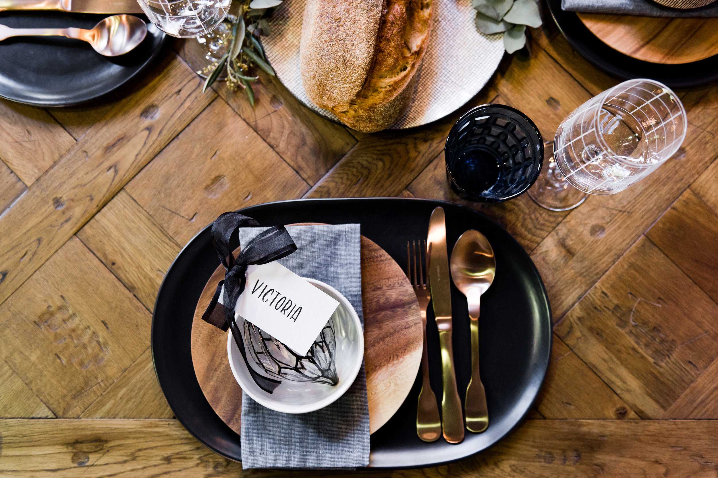
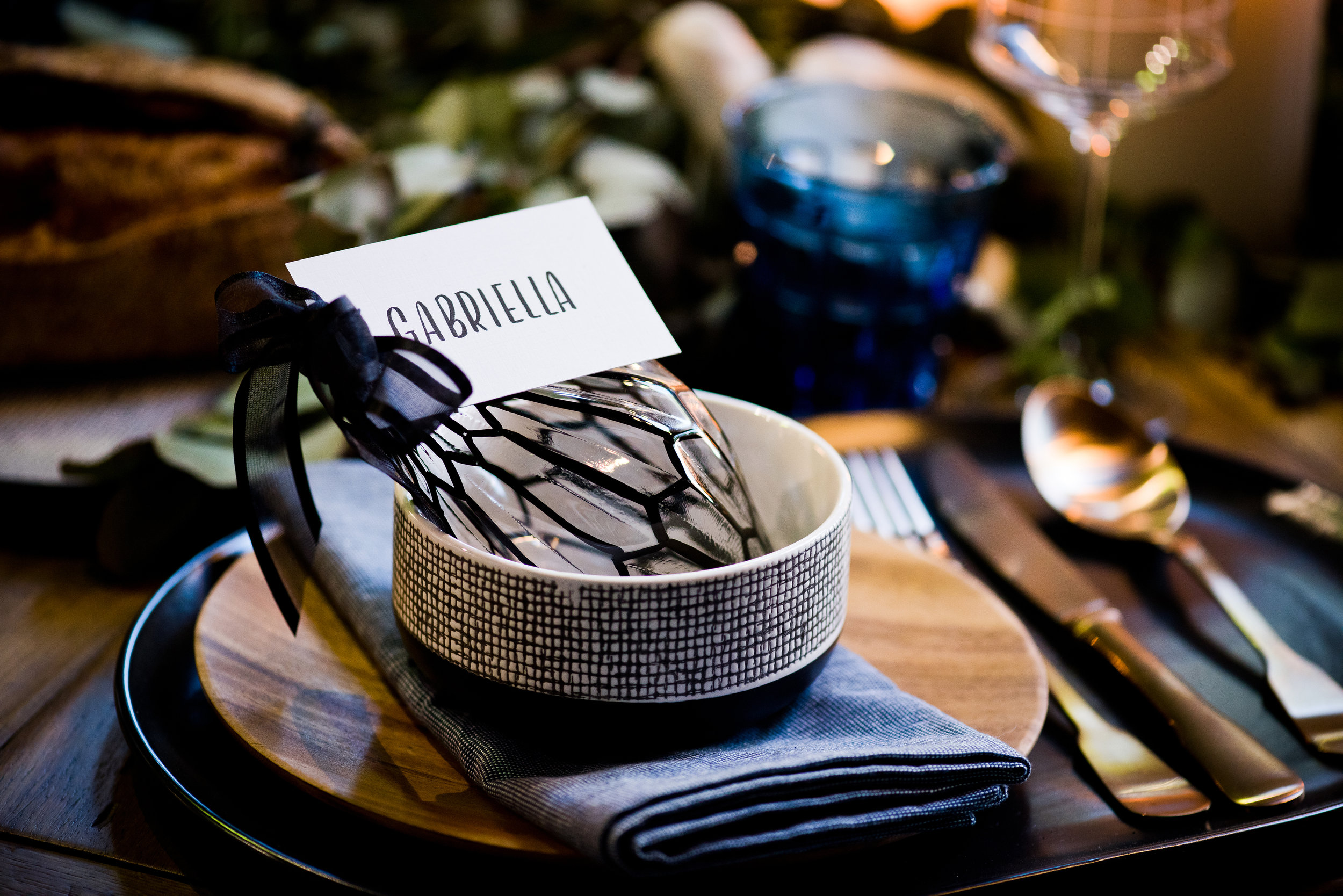
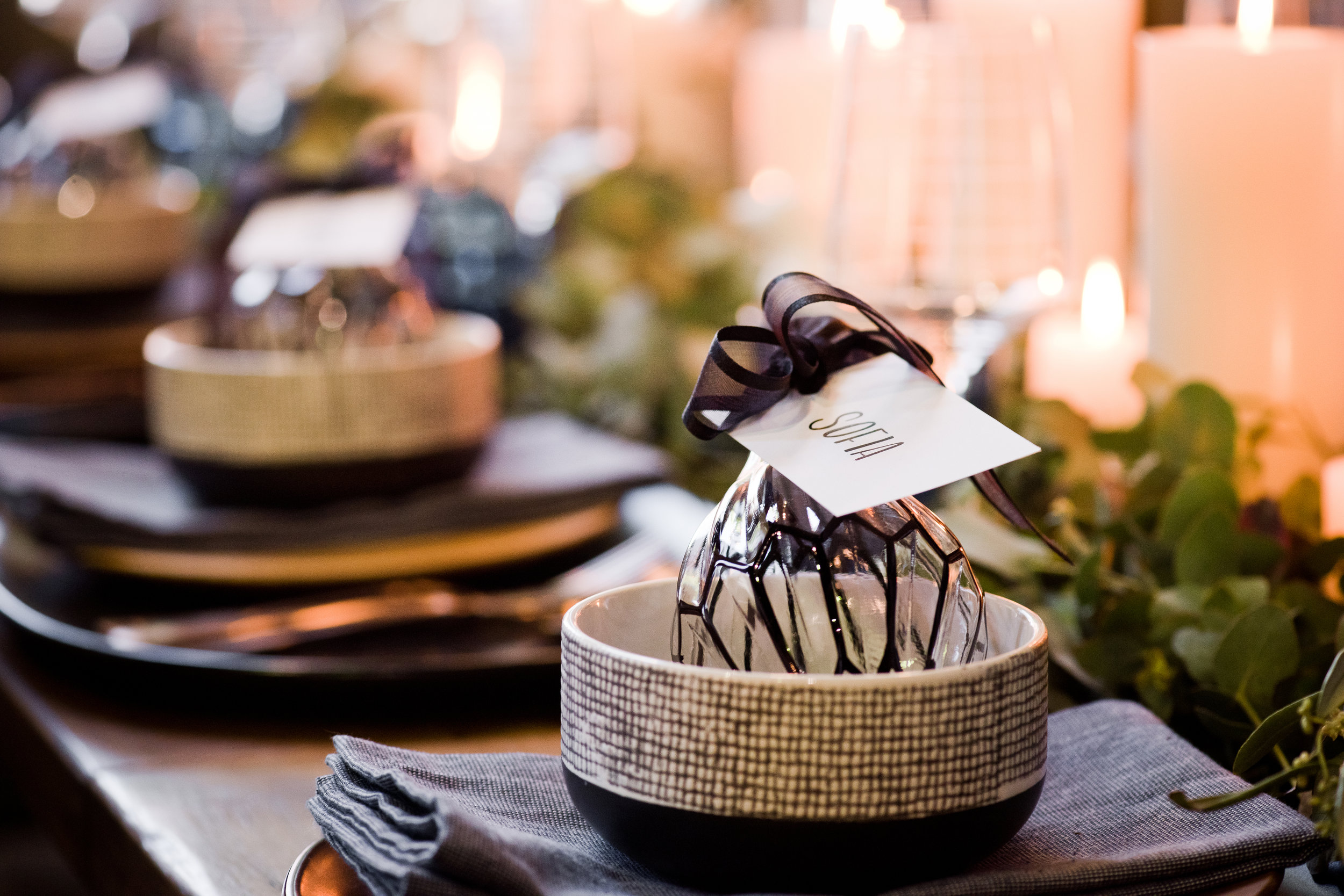
To achieve a similar look, consider gold and brass-coloured wares against darker tones or navy blues. This look is all about shiny, bright colours and textures against darker settings.
.04
A Whitsundays Look
For many of us in Australia, the beach is what we associate with Christmas and Summertime, and I particularly love this setting! It's playful, fun and full of interesting details. The table centrepiece is truly the star of the show, full of various beach objects nestled amongst sea grass, succulents and moss. Keeping the wares white and soft turquoise helped to draw attention to out centrepiece and balanced the overall look. Shades of turquoise were introduced through the serviettes and glasses. My favourite part has to be the name placement; fun sand-filled globes that can be taken home and used on the tree for years to come.
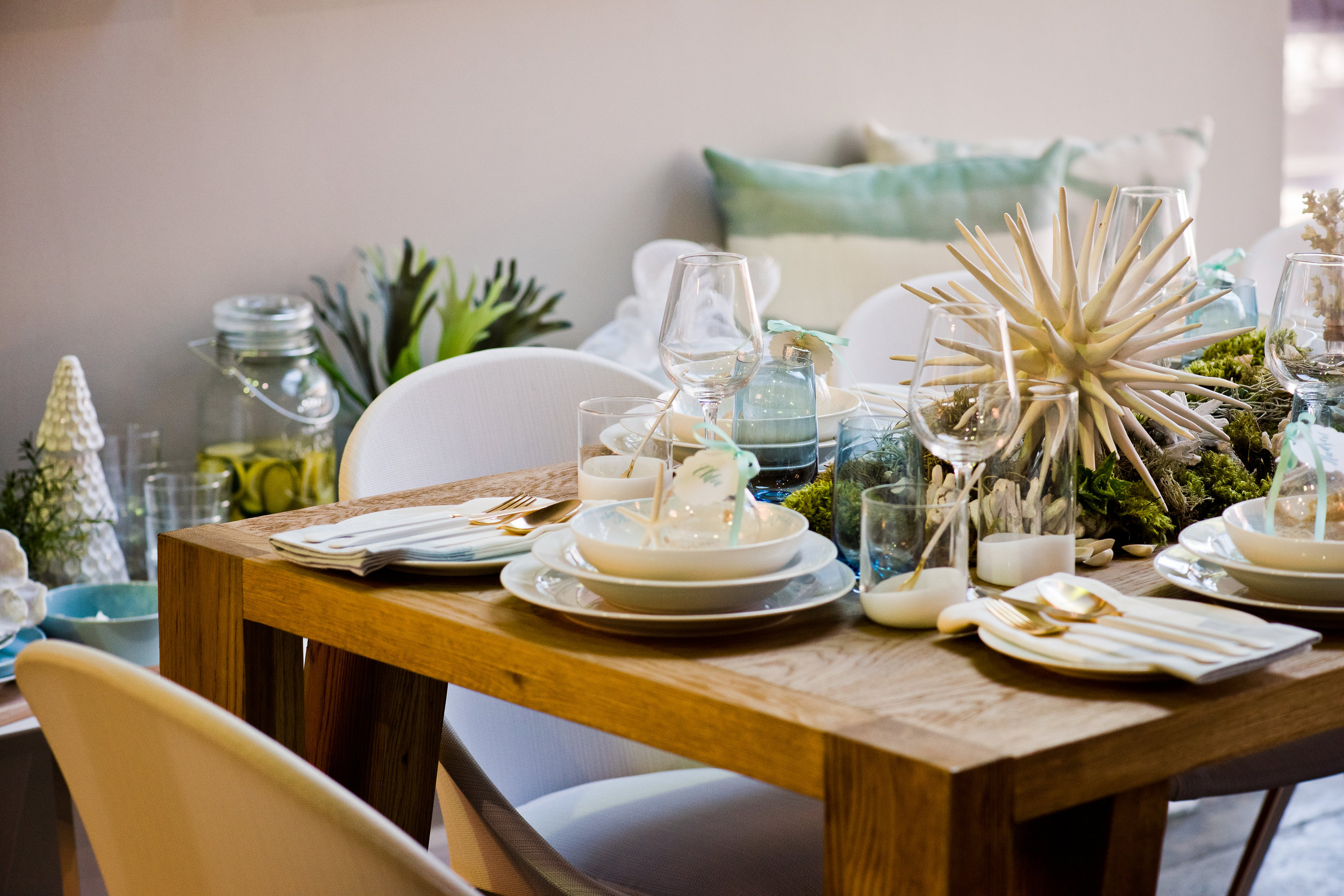
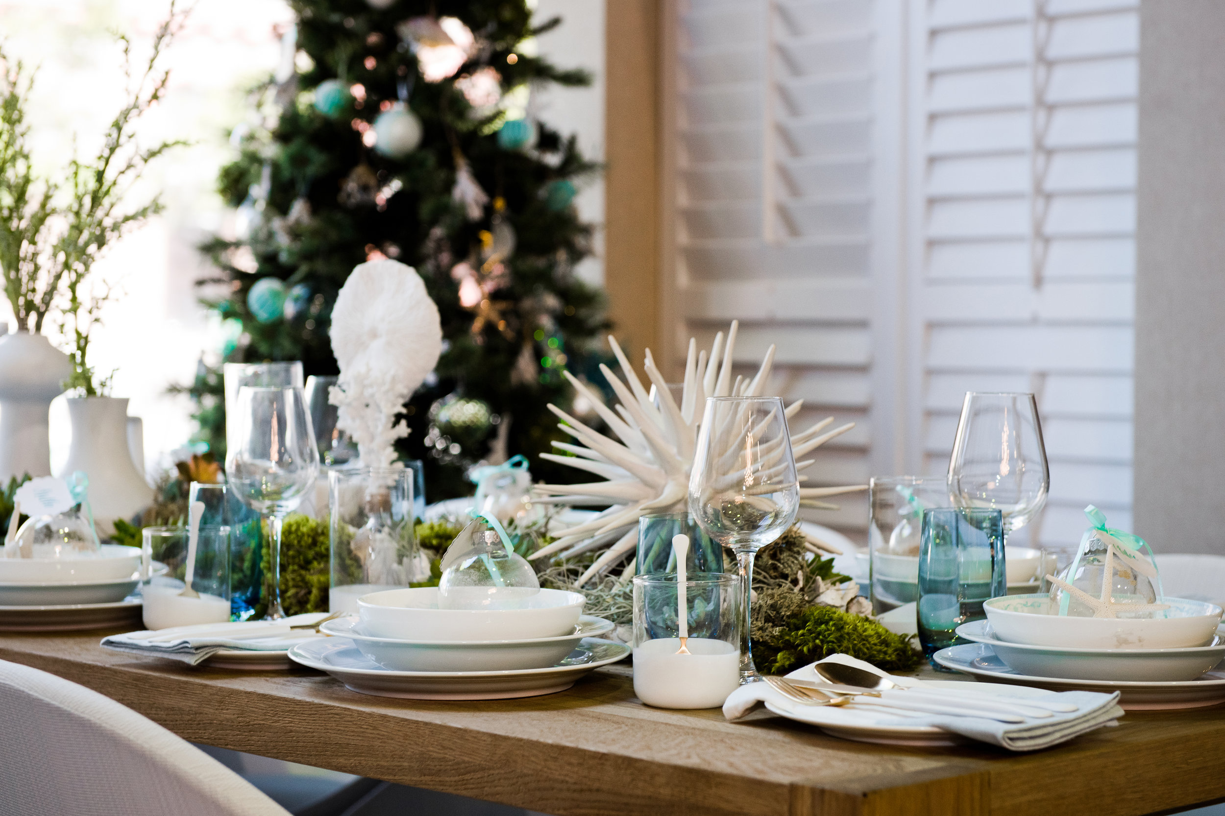
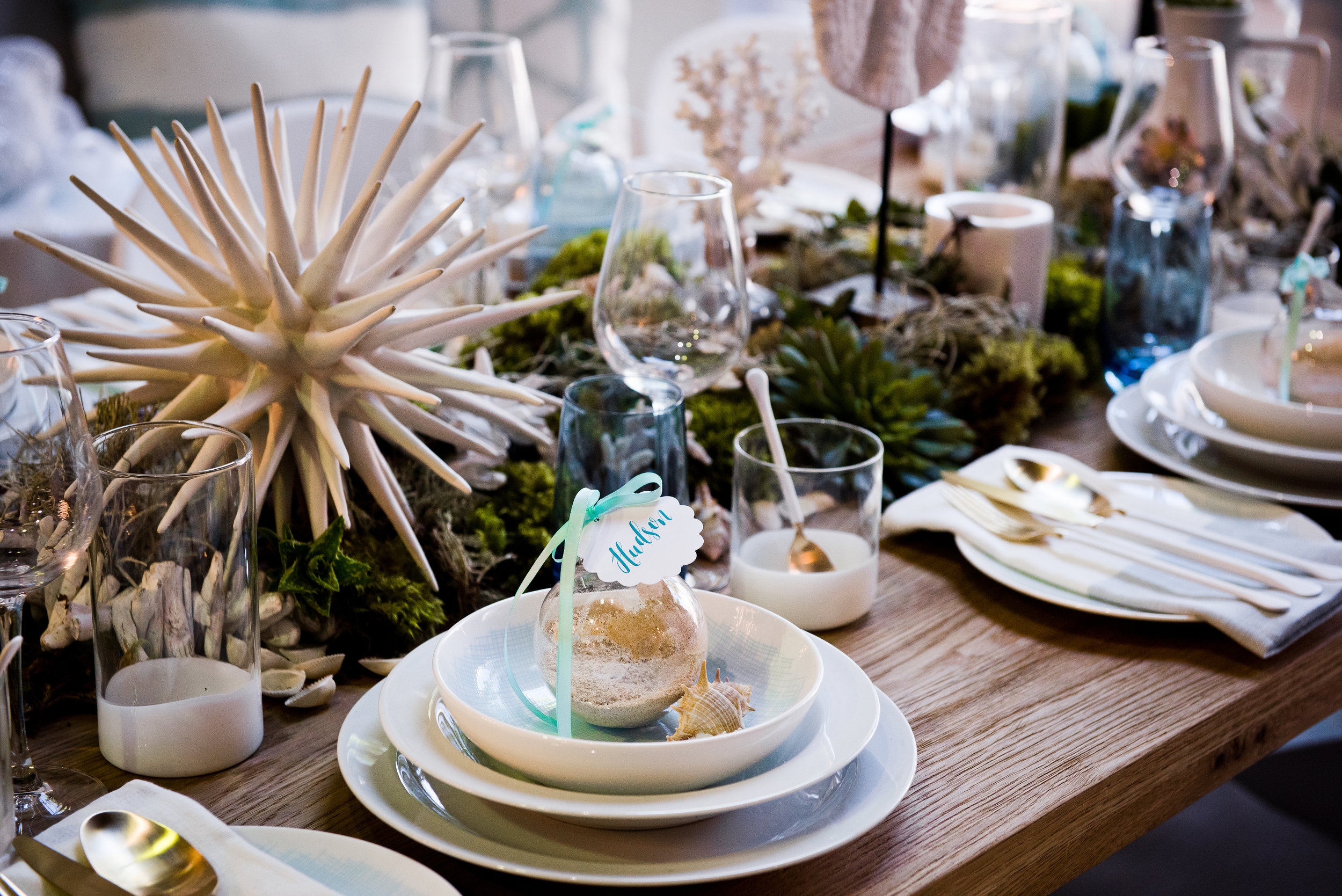
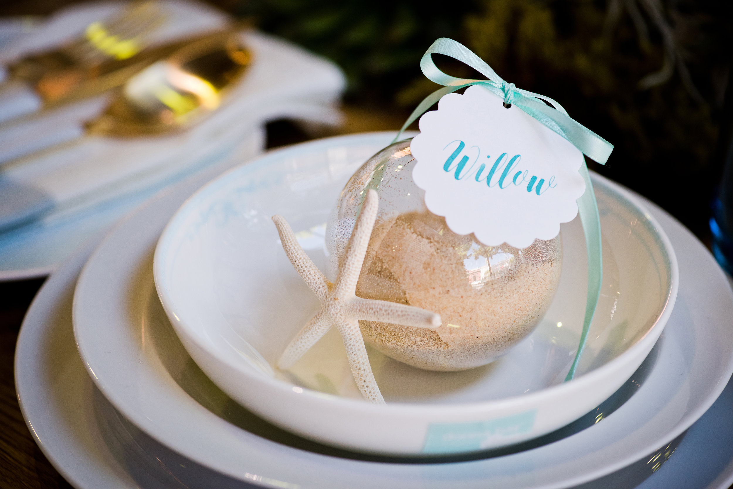
To achieve a similar look, think about how best you can introduce the colours and textures of the beach into the setting. Perhaps you could use sea shells, coral stars or fill some vessels with sand to create a beach vibe. This setting is all about pops of blues and greens against whites to reflect one of Australia's favourite coastal destinations.
